Business Flyer
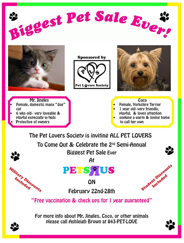
When I was creating my business flyer I wanted it to be visually eye-catching to grasp the audience’s attention so that they would be interested in reading my flyer. With that being said, I used bright and bold colors to make my flyer very appealing by applying it to the borders of the flyer. I made the title stick out by using a fun bolded front that would catch the reader’s attention. I created the PET’R’US logo to make my flyer look realistic and add some creativity. I also created an extra logo for the pet lover’s society that may not have been needed. I made this second logo using black for the font and image so that it wouldn’t take away for the first logo. I also used several bright colors that I thought were very appealing. I didn’t want the colorfulness to take away from the purpose of the flyer so I used black font to make the flyer readable and to add seriousness to the flyer. I figure too many colors would distract the readers for the flyer intended purpose and would also be difficult to read. I added colored font to words that I wanted to stick out such as “free vaccination & check ups for 1 year guaranteed” and “student discounts” because phrases like these pulls the reader in and making them want to attend the event. I added realistic images of a cat and dog to the flyer because their cute little faces would appeal more to the audience especially pet lovers. I also added little images of cat and dog paws that would automatically signal that the flyer was about pets. Overall I think I did a great job with the business design flyer and was actually impressed by how well I did. I didn’t expect it to turn out how it did but very satisfied that it did.