
CD Cover
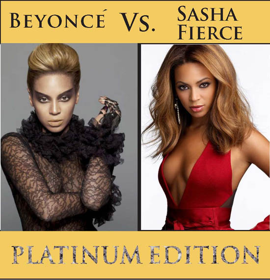
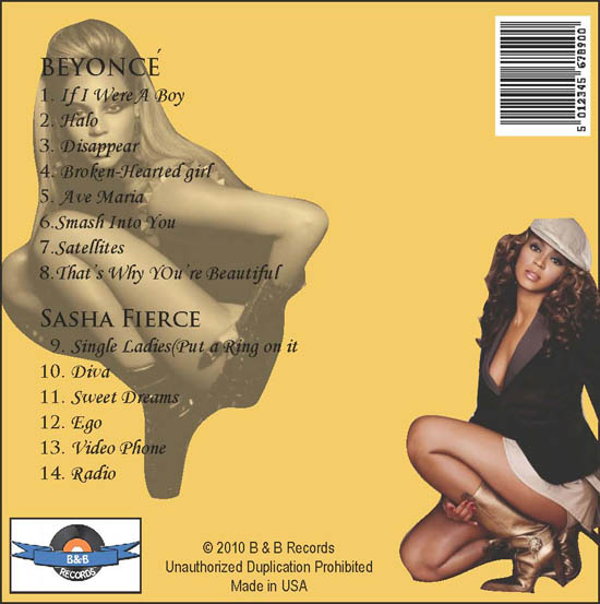
In the process of designing my cd cover, I decided that I wanted the cover to look as much realistic as possible. I chose a light but mild color for the background. I wasn’t too bright or too dark but just right. In order to make the visually appeal to my audience, I decide to use two fierce picture of Beyonce’. The first picture describes the good girl side of Beyonce’ that everyone knows and loves. The second picture describes the bad girl alter ego side of her that’s just starting to surface. Together these two pictures brought fierceness to the front cover which would catch the eye of the audience and stand out. I used the title “Beyonce’ vs. Sasha Fierce” to grasp my audience because it represents a battle between the two concerning whose the best. I also used the “Platinum Edition” title to catch the eye of my audience because when you hear the word platinum it symbolizes something being the best. I figure it would be eye-catching as well. I designed the platinum title by placing a picture of a platinum cluster inside of the text and then removing the stroke of the outline text by setting it to zero. For the back cover, I faded the opacity of Sasha’s picture to forty-eight percent so that I could place text over it without taking away too much attention from the other picture. I thought I did an excellent job on isolating the two pictures. Creating the label was the most creative part because I had to find a picture of a record, a picture of a banner, and then place them together as one after isolating the banner from its’ original border. Finally I had to create the company’s name inside the banner. The easiest part was finding the barcode. Overall I was very overwhelmed and very satisfied of how well the album was created.